The importance of site architecture for healthcare websites cannot be overstated. It’s not just about creating a website that looks good – it’s about creating an effective website that prioritizes user needs, especially in critical situations.
A well-structured healthcare website serves as a reliable, accessible resource for patients, caregivers, and healthcare professionals alike. It transforms complex medical information into navigable, user-friendly content that can potentially make a significant difference in someone’s health journey.
Imagine you’re feeling unwell and searching for medical information online. You land on a healthcare website, but it’s a maze of confusing links and buried information. Frustrating, right? This is where site architecture comes to the rescue, especially for healthcare websites.
What is Site Architecture?
Site architecture is the backbone of your website – it’s how your pages are organized and connected. Think of it as the blueprint of your digital home. For healthcare websites, it’s not just about looking pretty; it’s about saving lives by making critical information easily accessible.
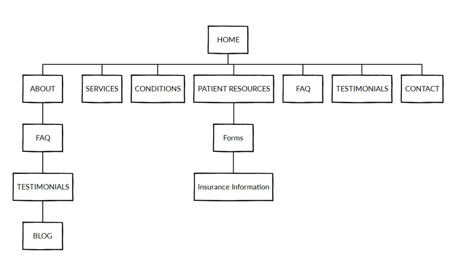
Visually website architecture can be expressed using diagram or sitemap.

The Vital Importance for Healthcare Websites
When it comes to healthcare, every second counts. A well-structured website can be the difference between:
- A patient finding crucial information quickly
- A worried individual giving up in frustration
Good site architecture ensures that your website is not just a collection of pages, but a life-saving resource that guides visitors to the information they need, when they need it most.
Key Elements of Effective Site Architecture
1. Clear Navigational Structure
A clear, intuitive navigation menu is like a friendly guide, helping visitors find their way around your site. For healthcare websites, this might include categories like:
- Symptoms Checker
- Treatment Options
- Emergency Information
Pro Tip: Use descriptive, jargon-free labels that your audience will understand.
2. Internal Linking: Creating a Web of Knowledge
Internal links are the threads that connect different pages of your website. They help visitors (and search engines) understand the relationships between different pieces of information. For example, a page about heart disease symptoms could link to:
- Diagnostic tests
- Treatment options
- Lifestyle changes
This creates a comprehensive resource that keeps visitors engaged and informed.
3. Content Organization: A Place for Everything
Organizing your content logically is crucial. Group related topics together and create a hierarchy that makes sense. For instance:
- Diseases & Conditions
- Heart Health
- Respiratory Issues
- Mental Health
- Treatments & Procedures
- Healthy Living
4. URL Hierarchy: More Than Just an Address
Your URL structure should reflect your content organization. A logical URL hierarchy helps both users and search engines understand the structure of your site. For example:
www.healthcaresite.com/heart-health/symptoms/chest-pain
This URL clearly indicates where the page fits within the site’s structure.
The Benefits: Why It’s Worth the Effort
- Improved User Experience: A well-architected site is easier to navigate, reducing frustration and increasing engagement.
- Better Information Accessibility: Visitors can find what they need quickly, which is crucial in healthcare.
- Enhanced SEO: Search engines can better understand and index your site, potentially improving your rankings.
- Increased Trust: A well-organized site appears more professional and trustworthy – essential in healthcare.
Putting It Into Practice
Improving your site’s architecture doesn’t have to be overwhelming. Start with these steps:
- Audit Your Current Site: Identify areas of confusion or redundancy.
- Create a Site Map: Visualize your ideal structure.
- Implement Changes Gradually: Start with high-traffic areas.
- Test and Refine: Use analytics and user feedback to continually improve.
Your Next Steps
Remember, a well-architected healthcare website isn’t just about organization – it’s about empowering people with the information they need to make informed health decisions.
Ready to transform your healthcare website into a user-friendly, information-rich resource? Start by reviewing your current site structure today. Your visitors (and their health) will thank you!
Conclusion
Your website often serves as the first contact point between your healthcare organization and people looking for help. A well-planned site structure makes sure this first impression leaves a positive mark on website visitors building trust and making it easy to access important information.
As you build your healthcare website, think of site structure as a key part of your online plan. It’s a smart investment that leads to happier users better search rankings, and in the end, helps you better serve your community’s health needs.
By focusing on clear navigation, logical design layout, and easy to read content, you’re not just making a website – you’re creating a useful public health tool. In doing so, you’re contributing to a more informed, patients who can take charge of their own health.
Make sure to look over and improve your website structure on a regular basis. In the always-changing world of healthcare and digital tech, it’s crucial to stay up-to-date on all the latest technology trends. By having a great website structure, you also provide accurate and easy to access healthcare information.


